If Hot Topic were to make a commercial in the style of
Robert Rodriguez, you’d have something like the live-action trailer for All
Time Comics, the new superhero line of floppies from Fantagraphics. Vapid
enough to make any Marvel movie seem like masterful storytelling, the trailer is
wildly successful in setting the tone for your reading experience. Much like
Crime Destroyer #1, the trailer is a pointless waste of money—the difference
being that, with the comic, the money will be your own.
Fantagraphics has built its brand on championing
sophisticated artists, original ideas, and strong points of view. Given its
stable of cartoonists, who are almost all auteurs, many onlookers were
surprised when Fanta announced it would publish work that involved such a high
degree of collaboration, much less for a genre it has historically regarded with disdain. What surprises
me is that Gary Groth took one look
at this material and staked “Fanta does superheroes” on a badly regurgitated
DC Universe. Gary, baby, I’ve got an idea for a series starring not-Wolverine that’s
gonna blow your freaking mind. Action!! Muscles! Big. Ole. Titties. Call me.
Despite All Time Comics’ profound lack of originality, Josh
Bayer, the writer who created the series with his brother Sam, likes to describe himself as an innovator. “Every Velvet Underground needs an Andy Warhol behind it,”
he said
in an interview, humbly characterizing his role as a creator and his brother’s
role as the project’s initial financier. It’s an interesting analogy. On one
hand, we have the most fiercely original band in rock history, whose avant-garde
sensibility shaped the likes of Bowie and Sonic Youth. On the other, we have
Josh Bayer pulling a bunch of comics clichés out of his hat without the
wherewithal to deploy them in an interesting, entertaining, or even marginally
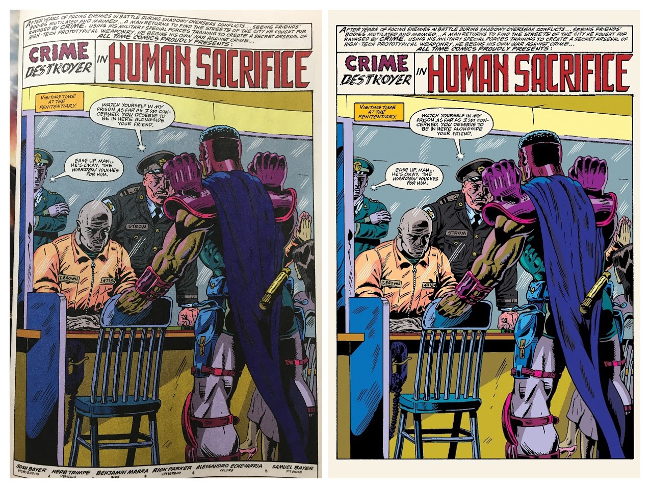
self-aware way. Note how some of Crime Destroyer’s lines (below, left) seem ripped from the journals of Alan Moore’s Rorschach (at right).


The difference of course is that Rorschach was supposed to sound ridiculous. Riddle me this: if Fantagraphics is such a meritocracy, how did this lorem ipsum-grade script, which never should have made it past the first edit, earn the approval of all those discerning eyes? All Time
Comics is not a love letter to the comics of old, as some have described it, nor is it parody; it
is the comics equivalent of off-brand cereal.
In assembling a team, Bayer shows some facility, if zero
interest in working with anyone who’s not a man. (Not that there are all that
many women associated with Fanta, but off the top of my head, Trina Robbins,
Anya Davidson, and Katie Skelly all have aesthetics that would have made sense for
this project.) Jim Rugg’s cover is a lot of fun even if the characters, from
left to right, move inexplicably from more realistic and detailed to cartoonish
and abstract. What happened to that purple lump at the bottom? Did our heroes
stomp all of the drawing out of him?

Predictably, Herb Trimpe’s pencils are well done (if too
busy for my taste). While I like the idea of an intergenerational team, I
wonder how much opportunity there was for meaningful collaboration. The disparate styles on the cover echo lightly through the rest of the book. Trimpe’s detailed
drawings and Alessandro Echievarria’s oversaturated color palette, for example, sometimes feel at odds with one another. Just a few tweaks would’ve mitigated the problem by a lot; you can see that those big colors are most successful in the
panels and spreads where they have room to breathe, and my guess is that a more tightly edited
palette would’ve better served the art.
I’m at a loss for how inker Ben Marra fits into all of this—I
don’t read superhero comics, so all this teamwork confuses me a little—but there
are a few depth-of-field problems I take to be his, that were then perhaps
exacerbated by the colorist? Listen, I’m out of my wheelhouse, but there are
places where something went wrong.

This fight falls flat...and also looks flat.
I can say with more confidence that the writing is weak. In Issue #1: “Woke Fukitor” “Human Sacrifice,” our hero
battles a gang of Satanic white supremacist gutter punk lizard people who
dress like pilgrims for some reason. As mixed-up as that may sound, I’m not one
to look a gift horse in the mouth: the pilgrim hats are by far my favorite
part.

Ah yes, every mother's worst nightmare...finding the dread pilgrim hat. My second favorite part is when Crime Destroyer says he knows the sewers "as well as his own face."

Haha, that's just too good. I know these streets like I know my own FACE. I'm totally going to start saying that.
So that's one thing: I only laughed at this comic, never with it. I think the stuff that's meant to be whacky and fun just comes across as formulaic, and that's at best. At the other end of the spectrum we have its attempt at political commentary, which is just unfortunate. It’s plain that the racially charged plot, which invokes slavery, lynching, and Black Lives Matter, is meant to echo real-world tensions—though to what end, I cannot say. There’s a whole thread about how black people are complicit in their own misery—Crime Destroyer burns down his own store and Anji, a half-black(?) white supremacist, wants to sacrifice herself to Wotan, whoever the fuck that is—but you know what? I’m not even gonna go there. It’s not worth my time, much less yours. Bayer’s heavy reliance on chunky exposition manages to explain nothing, and how could it be otherwise? This is irredeemable nonsense, which I might have been able to forgive had it managed to be the least bit entertaining. A word of advice to the creators as the series moves forward: more pilgrim hats.
So that's one thing: I only laughed at this comic, never with it. I think the stuff that's meant to be whacky and fun just comes across as formulaic, and that's at best. At the other end of the spectrum we have its attempt at political commentary, which is just unfortunate. It’s plain that the racially charged plot, which invokes slavery, lynching, and Black Lives Matter, is meant to echo real-world tensions—though to what end, I cannot say. There’s a whole thread about how black people are complicit in their own misery—Crime Destroyer burns down his own store and Anji, a half-black(?) white supremacist, wants to sacrifice herself to Wotan, whoever the fuck that is—but you know what? I’m not even gonna go there. It’s not worth my time, much less yours. Bayer’s heavy reliance on chunky exposition manages to explain nothing, and how could it be otherwise? This is irredeemable nonsense, which I might have been able to forgive had it managed to be the least bit entertaining. A word of advice to the creators as the series moves forward: more pilgrim hats.

Below, on one of the worst pages of cartooning I’ve ever
seen in my life, we learn Crime Destroyer’s backstory, such as it is. Once upon a time, Crime Destroyer was a war hero whose family was killed by looters. (I think??) Like...he returns from "the war" to his small town...which is overrun by criminals...doing crimes...who then murder his family, who lived in the store for some reason(?)...so Crime Destroyer murders the criminals, burns down his house-store, and moves to Optic City to fight the Satanic white supremacist gutter punk lizard pilgrim people. That's the best I can do. The vague, stilted second-person narration is brought to life in six awkwardly arranged bubbles that float hideously over a screensaver featuring Crime Destroyer's disembodied head. It’s as though each person on the ATC team was in competition with whoever went before him to
make this page more ugly and confusing as it went through production. The counterintuitive layout, the arrows, the background, those colors, the story itself—there’s just no conceivable explanation
for this series of choices other than “hold my beer.”

I’ve compared All Time Comics unfavorably to COPRA (here and here), and character construction
is just one more area in which this observation holds up. Despite knowing little about old superhero comics, I immediately recognized the antecedents of Crime
Destroyer, whose lack of superpowers, reliance on gadgets, and war against
urban blight point straight to Batman; of Atlas, a flying goody-two-shoes with
alien powers who’s always blathering about antimatter a la Superman; and of Bullwhip,
who is a blatant Wonder Woman knockoff in both character design and her
affinity for S&M. Crime Destroyer, with his ridiculous fist-of-solidarity
shoulderpads, isn’t the kind of ripoff that’s going to inspire the empty
chatter about copyright infringement that surrounds Michel Fiffe, so let’s put
it this way: what is an artist’s ethical obligation when he co-opts someone
else’s ideas? My own feeling is that if the Bayers are going to model their
creations so heavily on seminal characters, they should have something—anything—to say.
That’s a little different than insisting that the work
should have a coherent message or be politically correct. I like to joke around about
the Fantagraphics guys I call the Post-Dumbs (artists like Marra and Johnny
Ryan, who also works on ATC), and the Bayers, with all their heavily stylized stereotypes,
seem to fit right in. So far as I can tell the Post-Dumb hustle is in taking
loaded imagery, emptying it of meaning, and then decorating its husk with an
aesthetic strong enough that people will mistake it for an idea. I don’t
know how else to say it: there’s nothing
there. Contrast the “satire” of Johnny Ryan with Joan Cornellà, another Fanta
artist who makes nonsensical comics that traffic heavily in scatological sex
and violence. Cornellà’s strengths are so plain that anyone on the street could
tell you what he’s got--arresting images, perfect color palettes, a sense of timing, a surreal
sensibility—elements that come together in a way where not quite making sense becomes
part of its perverse social commentary. The fuck do those other guys got, apart
from a well-respected indie publisher? “Irony”?
Cause that’s the real selling point with All Time Comics, is
it not? The sheer novelty of Fantagraphics doing cape comics. That the
publisher thinks “are superhero comics art” is even a question says one thing.
That it seeks to answer it with this weak, retrogressive claptrap says another.
I genuinely wonder who this gimmick is even geared toward. Not to women. Not to
superhero comic fandom, surely. Not to the average Fantagraphics reader (meaning
folks reading Dan Clowes and Charlie Brown), who is
accustomed to buying comics as graphic novels or collections. Anecdotally, my
local shop, a regular comics store with a large selection of action figurines
and an indie section comprised mostly of books, had never heard of ATC. They
had to order it. I imagine I’d have to go to a specialty shop like Quimby’s to
find it on the shelf.
And, you know, maybe people are doing that, or ordering it themselves
from Fantagraphics. But so far as I can tell, the best way for most people to
buy All Time Comics is Comixology. That wouldn’t even be worth mentioning were
it not for the author’s note on the inside cover, where Josh Bayer crows about
how he’s single-handedly bringing back the pleasures of a bygone era by making a
comic book that you can hold in your hands:
The ALL TIME COMICS revolution is
just beginning, so tell your friends to switch off “Nyech-flix” and unplug the
Galaga console and start paying attention to the real ink, paper, and stapled
beauty of ALL TIME COMICS. Paper and ink is the true lifeblood of comics, don’t
ya know? And it’s never gone away!
Funny you should say that, Josh, given that literally every other Fanta comic I own has
better production values than this thing. (Like…who is he talking to, even?
Fanta only entered the digital marketplace for real a year or two back, and it’s
hardly their focus. All of my own Fanta comics are on paper. Even over on the
corporate comics side, floppies still outsell trade paperbacks and digital by, like, a lot.) This is not to
say that ATC looks bad. Clearly a lot of care went into printing this comic,
even though it looks and feels disposable. The colors look quite nice. But you
know where they look even better? On a backlit screen, where they’re a little
less muddy.
It's just one more example of how everything about the
concept and execution of All Time Comics seem deeply confused. Production decisions
that were, with old superhero comics, engineered to maximize speed and profit—in-house
collaborations, floppy format, variant covers, different titles set in a shared
universe—have here been rendered cumbersome, slow, and expensive. Crime
Destroyer #1 came out in early March; the next release in the All Time Comics
line, Bullwhip #1, is showing a ship date of May 31. At this rate, it seems uncertain
that the first four characters will have been introduced by the end of the
year—that is, assuming the series lasts that long.
My guess is that it won’t, but who knows? The combination of nostalgia and mediocrity is one that often proves irresistible in today's marketplace, and there's no telling how many of these things are already in production (or what the contracts look like). I hope to see at least a few more issues, anyway, just because I enjoy hate-reading it to an almost unwholesome degree. Josh Bayer has talked about how the series has "a greater significance beyond itself" and how "it stands for all comics," and I agree; for me, it epitomizes everything I dislike about Fantagraphics, alpha bro mall punks, and sexist male comics culture. All Time Comics offers no perspective on the past, and little pleasure in the moment. But it gives me a warm feeling about the future, thinking it will fail.